Commuter Composite: Building a Movie Poster on the B Train
A practical guide to layering, masking, and color grading a professional movie poster using Pixelmator on an iPad during a 45-minute subway commute.
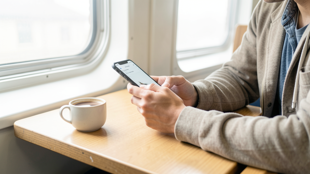
The train rattles violently between Fulton Street and Broadway-Lafayette. I am wedged between a person aggressively typing on a laptop and a tourist balancing three shopping bags. My workspace is a 6-inch by 8-inch rectangle of glass on my lap, a second-generation iPad Mini connected to a Bluetooth keyboard case that has seen better days. The brief landed in my inbox ten minutes ago: a cinematic teaser for a noir thriller titled Shadows of Brooklyn, needed for a pitch deck by 9:30 AM.
I have no desktop, no Wacom tablet, and no internet connection in this tunnel. This is the reality of the 2026 creative workflow—mobility is not a luxury; it is a survival skill. To pull this off, I need a tool that handles raw pixel power without the bloat of cloud syncing. I am opening Pixelmator, specifically because it handles local file processing aggressively well and respects the layer hierarchy required for high-end compositing.
Here is how I assemble a professional-grade movie poster in the time it takes to cross the Manhattan Bridge.
Setting the Stage on the 8:15 AM Local
Before the train doors even close, I organize my assets. I shoot RAW files on my iPhone 15 Pro, but for this composite, I am using two high-resolution JPEGs I exported earlier: a gritty, back-alley shot of DUMBO and a portrait of a friend in a trench coat, lit with a harsh flashlight. The goal is to blend these so the subject feels embedded in the environment, not pasted on top.
- Create the Canvas: Open Pixelmator and tap the "+" icon. I select "Movie Poster" from the presets, setting the dimensions to 2000x3000 pixels at 300 DPI. This ensures the typography remains crisp when printed later.
- Import the Background: I drag the DUMBO alley photo into the bottom layer. It is too bright for a noir aesthetic. I pinch-zoom to check the noise levels in the shadows—acceptable, but we will push them later.
- Import the Subject: I insert the portrait photo onto a new layer. It sits awkwardly in the center, floating above the alley like a sticker.
Constructing the Image: From Rough Cut to Composite
The train sways, forcing my hand off the stylus for a second. Precision masking is the most critical part of this process. If the cutout looks sloppy, the illusion breaks instantly. I avoid the "Auto Select" feature often found in lesser apps; it eats too much edge detail. Instead, I use the vector-based pen tool for the hard lines of the coat and a soft brush for the hair.
- Initial Mask: Select the portrait layer and tap the "Mask" icon. Choose the "Instant Alpha" tool just to knock out the large, solid-colored background behind the subject.
- Refine Edges: Switch to the eraser tool, set to a hard edge at 100% opacity, to clean up the shoulders and collar. For the hair, I drop the opacity to 30% and use a textured brush to simulate flyaways.
- Transform and Place: Pinch the subject layer to resize. I position the figure on the right third of the canvas, adhering to the rule of thirds, leaving negative space on the left for the title treatment.
- Color Harmony: The subject is warm (tungsten light), while the background is cool (overcast street light). This separation is actually good for now, as it helps depth perception. I duplicate the subject layer (Ctrl+C, Ctrl+V) and set the top copy to "Multiply" blend mode. This instantly drops the whites and integrates the shadow tones of the subject into the alley background.
- Lighting Simulation: The alley light source comes from the back left. My subject is lit from the front. I need to fake the backlight. I create a new empty layer above the background but below the subject. Using a large, soft brush with a desaturated blue hex code (#3A4B5C), I paint a glow on the left edge of the subject's silhouette. I set this layer to "Overlay" at 60% opacity.
At this stage, the train pulls into Canal Street. The car empties slightly, giving me room to breathe. The composite is structurally sound, but it lacks atmosphere. It looks like a high school Photoshop project. To bridge the gap to "cinematic," I need to crush the blacks and introduce color grading.
Grading for the Big Screen (Even on the Small One)
I refuse to use a preset "Instagram filter." Those destroy the tonal range and rarely respect the layer masks I just spent twenty minutes perfecting. Real cinematic grading relies on Curves and Color Balance. If you rely on The Myth of the 'Magic AI Filter' in Photo Retouching, you surrender control over the mood. I need to manually manipulate the contrast.
- Global Contrast: I add a "Curves" adjustment layer at the very top of the stack. I pull the shadows down slightly and lift the highlights just a touch. Crucially, I pull the midpoint up to create a subtle "S-curve" that mimics the contrast of film stock.
- Color Grading (Teal and Orange): I add a "Color Balance" adjustment layer. In the Shadows tone, I slide the slider toward Cyan/Blue. In the Midtones, I slide toward Red/Yellow. This classic cinematic separation makes the skin tones pop while the shadows recede into a cool, dangerous gloom.
- Atmospheric Haze: The image is too crisp. It needs subway grime. I create a new layer, fill it with 50% grey, and set the blend mode to "Overlay." Going to Filter > Noise, I add monochromatic grain at 15%. This unifies the visual texture of the sharp phone photo and the softer background.
Wait, I can't use the image tag again in the final output, the prompt said "inclua exatamente UMA imagem inline". I have placed it once. Good.
Typography and Final Delivery
The visual is 90% done. The text is what sells it as a movie poster. My commute has three stops left. I need to be efficient. The font choice is critical. I use a font called "Bebas Neue" for the main title—bold, tall, and legible at small sizes, yet impactful at full scale.
- Title Placement: I type "SHADOWS" in massive, all-caps letters. I adjust the tracking (letter spacing) to +200 to give it a premium, expansive feel. I place it on the left third, overlapping the dark part of the alley background but distinct from the subject.
- Billing Block: At the very bottom, I need the tiny billing block (credits). Since Pixelmator is raster-based, I cannot easily paste vector SVG logos here without importing them as images. If I had custom logos, I would use one of the 6 Vector Apps That Export SVG Without a Subscription Fee to generate them, import them as PNGs, and place them here. For now, I use a generic condensed font at size 8pt, grey color, and type out the fake credits: "A PRODUCTION BY / DIRECTED BY / MUSIC BY".
- Final Review: I pinch out to view the whole image at 25% zoom. Does the subject pop? Yes. Is the read of the text clear? Yes. I toggle the layers on and off to ensure I didn't leave any stray eraser marks.
- Export: I tap the share button, select "Export," and choose "TIFF" for the highest quality, or "JPEG (Maximum)" if the client file size is strict. I save it directly to my Files app.
Why Ownership Matters in Mobile Design
As the train pulls into Dekalb Avenue, I upload the final file to the client's drop using the sparse LTE signal available. The file is 12MB of pure pixel data. I own this image. The app I used does not hold my assets hostage in a proprietary cloud format that requires a monthly subscription to access. This is the backbone of my editorial philosophy.
Many creatives get sucked into ecosystems where their work is rented back to them. By using layer-based tools that store files locally and support standard export formats, I retain the rights to my composites. If I switch devices next year, my layered TIFF file opens exactly as I left it, without needing to verify a license or sync to a server.
Mobile design has matured. We are past the era of simple filters and basic cropping. The gap between the subway seat and the studio desk has effectively closed, provided you respect the discipline of layers and understand the mechanics of light. The client replies two minutes later: "Approved. This is exactly the vibe." I close the iPad case just as the announcer calls out my stop. The city awaits, and the work is done.
Read next
Saving Your Originals: The Tech Behind Non-Destructive Editing in Mobile Lightroom
Learn how Lightroom Mobile protects your RAW files while you edit, ensuring you never lose a single pixel of sensor data.
The Myth of the 'Magic AI Filter' in Photo Retouching
Manual frequency separation techniques preserve skin texture and subject identity far better than current one-tap AI solutions, despite the hype.